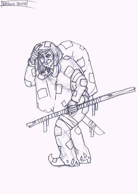
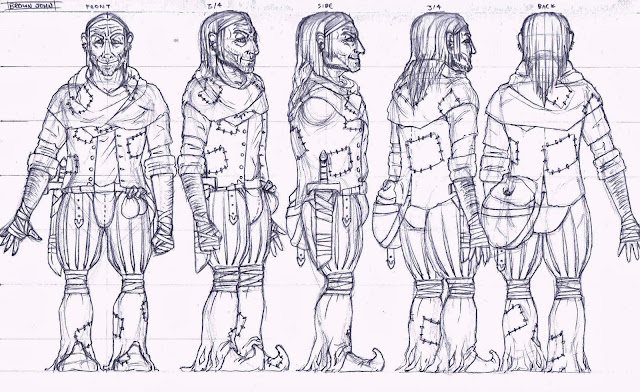
Portrait of Brown John –
This piece exudes a lot of character. It is clear that it
has stuck closely to the description of the character of Brown John given in
the book. It has also taken inspiration from the works of Paul Kidby. While the
piece is most certainly not anatomically correct, this was a clear design
decision made to make the character portray his qualities more readily. Lack of
a proper finish lets this piece down somewhat, as parts such as the hair have
been given far less attention than the eyes of example. This, however, was again
a design decision. As the piece was only ever intended to be a sketched idea of
the character’s portrait, creating focal points and paying particular attention
to some details really brings the piece forward whilst maintaining its presence
as a sketch. The attention to detail in the eyes is particularly important, as
the eyes can say a lot about the character. For this one, it clearly shows that
he is kind and empathetic, but has a spark of fun behind him. If it were to be
drawn again, more attention would be paid to the wrinkled forehead and the
eyebrows, as these are key features of the character, adding to his
personality.
Character Design of Kitzakk Soldier -
A lot of thought and visual research has gone into this
piece, aiding its authenticity and firmly placing it into the world that it was
intended for. The stance and posture of the figure implies that he is
disinterest in the machinations of weaker individuals and sees himself as
better than others. A pompous figure who regards the arrows embedded in his
shoulder armour with the same disdain he shows for the archer who fired them.
His outfit design is practical for the climate he is intended to be placed in;
a desert, and shows that he is combat ready. The character design is intended
to be that of a scout, a desert raider. It could be argued that this character
is too heavily armoured to be a mere scout, however, the design decisions are
based upon the descriptions given in the book and so discrepancies with this
can be put down to personal interpretation. One flaw in the piece is that not
enough space was given on the page, leading to the foot being cut off at the
bottom. This is something that would not show well in the eyes of potential
clients, as it implies that there was no ideas or thoughts behind the ‘missing’
parts.
Character Model Sheet of Kitzakk Soldier –
Whilst this piece from first glance looks impressive,
there are, however a number of flaws that cause it to be somewhat impractical
if it was intended to be taken on into a 3D modelled version of the character.
The front, side and back images look well designed and drawn; however, the ¾
views look stiff and lifeless with some anatomical issues that hinder the piece
as a whole. The impracticalities start with the 5 images being too close
together, meaning there is overlap in some cases and rendering some parts
useless to a modeller. This is not as bad as it sounds however, as the
overlapped parts are, in general, shown elsewhere on the sheet in full
detail. Another flaw is that the
procedural A-stance has not been properly adopted by the characters, thus making
the sheet more difficult to utilise. It is clear however, that the A-stance was
not used as the overlap that already exists would be increased dramatically.
Overall, the piece isn’t bad, far from it, but it does not conform to
professional practices and in this it is let down. It does however remain true
to the original design of the character, including all the details.
Final Character – Kitzakk Soldier –
This piece evokes the character it portrays well. It is
clear to the viewer that, though a sand storm billows around him, he is not
lost, nor is he worried. He casually strides over a sandy bank, unfazed his
surroundings. Clearly, he lives here, or at least he knows the area well. From
a distance, this painting looks highly detailed, however, on closer inspection
it can be noted that the brush strokes could be described as messy, some of
which are bold. This rough and rugged style of painting aids in defining the
character, showing him as battle and weather-worn. What could be improved on in this piece is
bringing the character’s left hand forward by highlighting it more, as it is
almost lost as to what he is doing with it. The rope he is holding in that same
hand trails off into the storm, but to what? Perhaps it would have been better
to indicate the horse that was intended to be being pulled along by the rope,
even just with a shadowy figure. The banner looks somewhat static in the air,
even though it should be straining tremendously against the wind pulling it in
all directions. The best way to fix this would probably be to fade the tone of
the banner a bit as it reaches the frayed edges, thus giving it more depth.
This piece certainly shows a lot of promise. The
character is well portrayed, showing his initial dishevelled look, but also his
in-charge posture and wise face that rounds him off. In general, the character
is drawn well, though his neck could do with a bit of work. It is also clear
that the style of the Prince of Persia 2008 game has been adopted here with
reasonable success. The black outline is crucial in making the piece ‘pop’ and
turns what would otherwise have been a mediocre image into a good one. The
piece would have benefited more had it been completed using either watercolours
or digitally painted, as the coloured pencils, whilst achieving a soft look to
the clothing, makes it look a bit rough and give the impression of having been ‘coloured
in’. More practice with the material would of course improve results, so as an
early attempt at using coloured pencils seriously, it is still quite effective
and shows a willingness to try new methods. The colours used in the piece have
been chosen quite well, though the burgundy of the waistcoat could have been
changed, or at least the pencil itself could have been used more effectively,
as the effect given is very messy compared to other parts of the image. At any
rate, the subdued colours aid in making the character’s overall appearance
unimpressive (as it should be).
Life Drawing – 20 minutes –
It is clear straight away that the main focus of this
piece from the offset would be the rather tricky perspective given by the model
lying with limbs going towards the viewer. With only 20 minutes given to complete
the task, it has been accomplished to a reasonable standard. The legs in
particular show good perception of perspective and provide a sense of depth to
the piece, even though it is but a line sketch. The problems with this piece
start at the torso. The upper half of the model looks very awkward, with the
shoulders hunched drastically. The arms too do not hold the same sense of
perspective as the legs and seem somewhat misshapen. The left hand looks
somewhat promising, but is let down by the unnatural looking fingers. The head looks a bit too small as well, though
perhaps the perspective makes this correct. The face bears a very suspicious
look, though this was most likely not intended. It is evident that the perspective has caused
some anxiety and panic, leading to the unsureity of where to place charcoal to
paper. As a difficult pose with a relatively short time constraint however,
this piece is still quite successful and a good learning experience.


