Wednesday, 15 January 2014

CAP - Project Evaluations

As part of our submission, we were also to choose 6 of our pieces and write short evaluations on them. These pieces could be taken from anything we did during the Computer Arts Practice module.


Portrait of Brown John –
This piece exudes a lot of character. It is clear that it has stuck closely to the description of the character of Brown John given in the book. It has also taken inspiration from the works of Paul Kidby. While the piece is most certainly not anatomically correct, this was a clear design decision made to make the character portray his qualities more readily. Lack of a proper finish lets this piece down somewhat, as parts such as the hair have been given far less attention than the eyes of example. This, however, was again a design decision. As the piece was only ever intended to be a sketched idea of the character’s portrait, creating focal points and paying particular attention to some details really brings the piece forward whilst maintaining its presence as a sketch. The attention to detail in the eyes is particularly important, as the eyes can say a lot about the character. For this one, it clearly shows that he is kind and empathetic, but has a spark of fun behind him. If it were to be drawn again, more attention would be paid to the wrinkled forehead and the eyebrows, as these are key features of the character, adding to his personality.


Character Design of Kitzakk Soldier -
A lot of thought and visual research has gone into this piece, aiding its authenticity and firmly placing it into the world that it was intended for. The stance and posture of the figure implies that he is disinterest in the machinations of weaker individuals and sees himself as better than others. A pompous figure who regards the arrows embedded in his shoulder armour with the same disdain he shows for the archer who fired them. His outfit design is practical for the climate he is intended to be placed in; a desert, and shows that he is combat ready. The character design is intended to be that of a scout, a desert raider. It could be argued that this character is too heavily armoured to be a mere scout, however, the design decisions are based upon the descriptions given in the book and so discrepancies with this can be put down to personal interpretation. One flaw in the piece is that not enough space was given on the page, leading to the foot being cut off at the bottom. This is something that would not show well in the eyes of potential clients, as it implies that there was no ideas or thoughts behind the ‘missing’ parts.


Character Model Sheet of Kitzakk Soldier –
Whilst this piece from first glance looks impressive, there are, however a number of flaws that cause it to be somewhat impractical if it was intended to be taken on into a 3D modelled version of the character. The front, side and back images look well designed and drawn; however, the ¾ views look stiff and lifeless with some anatomical issues that hinder the piece as a whole. The impracticalities start with the 5 images being too close together, meaning there is overlap in some cases and rendering some parts useless to a modeller. This is not as bad as it sounds however, as the overlapped parts are, in general, shown elsewhere on the sheet in full detail.  Another flaw is that the procedural A-stance has not been properly adopted by the characters, thus making the sheet more difficult to utilise. It is clear however, that the A-stance was not used as the overlap that already exists would be increased dramatically. Overall, the piece isn’t bad, far from it, but it does not conform to professional practices and in this it is let down. It does however remain true to the original design of the character, including all the details.


Final Character – Kitzakk Soldier –
This piece evokes the character it portrays well. It is clear to the viewer that, though a sand storm billows around him, he is not lost, nor is he worried. He casually strides over a sandy bank, unfazed his surroundings. Clearly, he lives here, or at least he knows the area well. From a distance, this painting looks highly detailed, however, on closer inspection it can be noted that the brush strokes could be described as messy, some of which are bold. This rough and rugged style of painting aids in defining the character, showing him as battle and weather-worn.  What could be improved on in this piece is bringing the character’s left hand forward by highlighting it more, as it is almost lost as to what he is doing with it. The rope he is holding in that same hand trails off into the storm, but to what? Perhaps it would have been better to indicate the horse that was intended to be being pulled along by the rope, even just with a shadowy figure. The banner looks somewhat static in the air, even though it should be straining tremendously against the wind pulling it in all directions. The best way to fix this would probably be to fade the tone of the banner a bit as it reaches the frayed edges, thus giving it more depth.


Final Character - Brown John - 


This piece certainly shows a lot of promise. The character is well portrayed, showing his initial dishevelled look, but also his in-charge posture and wise face that rounds him off. In general, the character is drawn well, though his neck could do with a bit of work. It is also clear that the style of the Prince of Persia 2008 game has been adopted here with reasonable success. The black outline is crucial in making the piece ‘pop’ and turns what would otherwise have been a mediocre image into a good one. The piece would have benefited more had it been completed using either watercolours or digitally painted, as the coloured pencils, whilst achieving a soft look to the clothing, makes it look a bit rough and give the impression of having been ‘coloured in’. More practice with the material would of course improve results, so as an early attempt at using coloured pencils seriously, it is still quite effective and shows a willingness to try new methods. The colours used in the piece have been chosen quite well, though the burgundy of the waistcoat could have been changed, or at least the pencil itself could have been used more effectively, as the effect given is very messy compared to other parts of the image. At any rate, the subdued colours aid in making the character’s overall appearance unimpressive (as it should be).


Life Drawing – 20 minutes –
It is clear straight away that the main focus of this piece from the offset would be the rather tricky perspective given by the model lying with limbs going towards the viewer. With only 20 minutes given to complete the task, it has been accomplished to a reasonable standard. The legs in particular show good perception of perspective and provide a sense of depth to the piece, even though it is but a line sketch. The problems with this piece start at the torso. The upper half of the model looks very awkward, with the shoulders hunched drastically. The arms too do not hold the same sense of perspective as the legs and seem somewhat misshapen. The left hand looks somewhat promising, but is let down by the unnatural looking fingers.  The head looks a bit too small as well, though perhaps the perspective makes this correct. The face bears a very suspicious look, though this was most likely not intended.  It is evident that the perspective has caused some anxiety and panic, leading to the unsureity of where to place charcoal to paper. As a difficult pose with a relatively short time constraint however, this piece is still quite successful and a good learning experience.

CAP - Death Dealer - Envisaging the Characters

With much of the research aspect of the project complete, it became possible to move on to actually conceptualizing the 2 characters. I decided to start with Brown John first, as I already had an idea of what he might look like floating around in my head.

To begin the imagining of Brown John, I decided to use the tried and tested method of character silhouettes. This way I could pick out designs that I felt best suited the character without being hindered by details, such as his face or how many buttons are on his tunic.


From these 27 silhouettes, I went on to choose my favourites. Some for the posture, others for the general 'feel' of the design and some to focus on particular aspects of Brown John's character, such as the fact that he is an entertainer.


From these 9 chosen silhouettes, I picked 3 to turn into initial character sketches. It's not hard to see what silhouette became what sketch. This is something I find very agreeable with using silhouettes is that the best designs can be hand-picked with a relatively quick glance.


I decided at this point that before I move on to amalgamating these 3 ideas into the 1, I would spend some time developing a profile for the character. In other words, Brown John's face.


I focussed quite heavily on the descriptions he was given in the book and this was made easier by the fact that I had some idea as to how I wanted him to look. None of the above were exactly what I was looking for, but I knew I was nearly there, and so I did a final portrait piece to bring the ideas together.


I took a lot of inspiration from the art of Paul Kidby when creating Brown John's portrait and I am very pleased with the outcome as I feel it exudes plenty of character and fits the description given in the book. Though I am sure others having read the book might totally disagree, as we all have slightly different interpretations of characters in books and what doesn't exactly meet to our minds description, somehow just doesn't look right.

With the face nailed, I moved on to sketching out the final design for the character, bringing together my favourite parts from the 3 previous sketches.


I wasn't particularly pleased with this piece, however, I had got Brown John wearing what I wanted him to be outfitted in, and as it was only a sketch and I would be creating another final piece anyway, I decided to leave him as he is. I could now move on to the character model and accessory sheets - something I had never really done in the past before, so would make for an interesting experience. My only worry about the accessory sheet was the fact that Brown John does not carry many 'accessories'.


I was pleased with the result of the character model sheet as I had managed to stay true to my design. I found the 3/4 views rather difficult to accomplish and I don't think they add much to the sheet other than possibly lowering the quality of the image.


As I had said, Brown John really doesn't carry much, so I designed his short-sword, pouch and a small satchel for him.

At this point, I really wanted to move onto my other character, the Kitzakk soldier and come back to doing a final piece for Brown John when my mind was fresh and not so bogged down by having to have drawn him so many times.

Again, as with designing Brown John, I began with silhouetting character designs for the Kitzakk soldier. Not yet decided as to what sort of Kitzakk he should be, I encompassed all the details described in the book into the different silhouettes, focussing on the fact that they would essentially look like Japanese warriors.


Again, from these silhouettes, I chose my preferred designs based on posture and overall look.


From these 8 designs I again selected my favourites and turned them into 3 sketches. I adopted some of the aspects of silhouettes I had not chosen into my designs as well, as I felt that they assisted in developing  the character.


I found it very difficult to alter the design of the armour at all, as I was essentially designing Japanese bamboo armour, which I found looked best in the first sketch that I came up with, but looked more like roof tiles in the second design. The third design, I feel the bamboo aspect of the armour was lost. However, I liked the crossbow, trousers, helmet and back banner of the third design and I liked the main armour of the first design. I didn't feel there was anything to be taken from the second sketch, as his armour looks far too roman-esque and the other aspects are better designed in the other 2 sketches. Again though, like Brown John, I wanted to develop the Kitazakk soldiers face and so produced a variety of designs to choose from:


Some of these designs I felt didn't suit the Kitzakk soldier, but they did provide ideas that could be used in the final design. So I amalgamated a number of the faces into one design.


I was not at all happy with the outcome of this portrait. It just didn't work to me at all, but there were aspects of it that I liked, that I would want to utilise. So I did another portrait, focussing on getting rid of the details I disliked and keeping those that I felt worked well with the character.


I was much more satisfied with this design. From the bandages protecting his head from the sun, should he remove his helmet, and the cracked, dry skin, I felt that I had created a good design for a desert raider of sorts.

With his portrait sorted, I moved on to creating the final design for the Kitzakk soldier, taking the aforementioned aspects into consideration when putting him together.


I was very pleased with this design, it had all the right aspects that I was looking for and I particularly liked the pose of just casually strolling with 2 arrows embedded into his shoulder armour, looking disdainfully at the bowman who fired the shots.

To complete the character, I moved on to the character model and accessory sheets.


I found this to take a considerable amount of time to do, due to slowly losing interest and my will being sapped from having to draw those trousers over and over with all the studs on them I am, however, happy with the outcome, so I can't really complain.


Fortunately, the Kitzakk soldier had a lot more accessories than Brown John and so I was able to ptoperly fill up the page with designs. I am pleased with the pattern I chose to utilise throughout the Kitzakk's design, as it adds a bit of detailed interest, almost like a spot-colour.


With the character's designed and their model and accessory sheets complete, I could then move on to painting up final pieces for them. First up is the Kitzakk soldier. Due to how much I like the posture and design that I already have in place for him, I have used that as the basis of my digital painting:


I am very pleased with how this piece came out, as I really feel it shows the true grittyness of the Kitzakk soldier. The fact that he strolls casually through a sand storm with a deft grimace set on his weather-beaten face shows what a seasoned warrior he is.

The final task was to do a rendered version of Brown John, but as I was not happy with my 'final' sketch of him, I did a new one:


I decided that for this piece I would base the style on that of the 2008 'Prince of Persia' game that was suggested in the brief. I also decided that I would make this a traditional artwork and use coloured pencils to render it.


I am fairly pleased with how this came out, though I would certainly say that the use of coloured pencils is not particularly favourable. I do like Brown John's face however, as I think it envisages his description from the book.


Lastly, the brief requires 6 evaluations on any pieces that I have done throughout the semester, which I shall create a new post for.

Saturday, 30 November 2013

CAP - Death Dealer Research - Part 2

As it would transpire, I was wrong in thinking that I was to base my imagining of the characters off of the Death Dealer series of paintings.

Instead, there is to be found a series of books, written by James Silke, that tell the story of the Death Dealer.

This makes far more sense when it comes to the part about designing 2 characters; in other words, it is 2 different characters that I have to design based on their descriptions within the book, not 1 character reimagined.

In this case, I read the first of the Death Dealer books, 'Prisoner of the Horned Helmet', which I found to be a most enjoyable read. There are a number of interesting characters that I feel I would like to design. I know for certain I will be using the character of Brown John as one of my choices, however, at this point in time, the 2nd character is a toss-up between Cobra, Queen of Serpents, or a Kitzakk soldier. I feel Cobra will offer up a challenge, being, as descirbed in the book, a woman with "A lush body, ripe with curves." I generally try never to over sexualise my female characters, so much so to the extent that they are often mistaken for males, or the viewer is unsure as to which gender the are. I think it could be interesting to attempt to design a character who would need to be viewed in outwardly sexual manner, given that she is the temptress character within the story. The Kitzakk, on the otherhand, have very detailed descriptions of their armour and a wide variety of warriors from which to choose from. I am particularly keen on the fact that theses brutal warriors use a lot of ornate butterfly imagery within their armour designs. 

Even though I have done a lot of research for this project already, and although some of it is slightly defunct now, I believe I can still use it to my advantage and still take inspiration from it so that it wasn't a complete waste of time for me. I have new research in the form of pages and notes from the book, as well as looking at the work of  Paul Kidby, who did the artwork for the Discworld franchise and who I believe will be of great inspiration, due to his excellently portrayed characters.


Having decided on Brown John as my first character, I have created 3 moodboards to coincide with the character based upon the following descriptions of him and his accessories from the book:


"the wagon had not intended it to be a shy vehicle. It's flatbed, sode boards, driver's box and shaft were as red as a harlot's lips and trimmed in a pink and orange so bright they would have made the same harlot blush."

"a clan of outcast and outlawed entertainers."

"wagon was designed to serve as a travelling stage"

"Old Brown John sprawled in the bed of the wagon, and despite the clattering wheels and bouncing boards, dozed comfortably on a pile of ragged blankets beside a clutter of coiled ropes."

"He wore a ragged brown tunic with large patches which, in addition to covering holes, were the clan's sign. He was short, wiry and bany-legged. At first glance he appeared no more impressive than his patches, but on closer examination, even in his prone and snoring position, he had a surprisingly alert, in-charge and genial manner."

"wore leather belts hung with pouches and short swords."

"His white hair fell in smooth silky slopes down over his large ears and bristled with tufts at his neck. His tangled white eyebrows, rising at sharp angles, gave his face a slightly satanic expression. It was deeply cut with all varieties of wrinkles, but they only gave a vague indication of the complexity of his wrinkled mind."

"traded our wine for his meat"


Terry Pratchett's Discworld artwork by Paul Kidby

Brown John outfit and character reference

Wagons


With these moodboards for Brown John, I can now move on to silhouetting character ideas for him.

I have decided that my second character will be a Kitzakk soldier, as I think it will make a good contrast to Brown John. I will simply design the character based upon the descriptions of all the Kitzakk soldiers throughout the book, including the named characters, as none of them last long enough to make them key characters. I think it will be good to get an over-all image for the Kitzakks, which could then be taken on to developing different versions of the soldiers, depending on their duties and rank.

Again, like Brown John, I have created moodboards for the Kitzakk soldiers based upon the various descriptions of them in the first book:


"riders with crossbows in their saddle holsters and sheathed swords, quivers and daggers riding their belts. Scouts."

"Their horses were small, scarred, with braided manes and tails. Durable. The riders were more so, leather-skinned veterans of the desert campaigns. They were Hunters"

"Helmets, arm bands and breastplates were black-laquered bamboo striped with steel bands. Skirts were wide leather thongs mounted with steel studs. Crescent moons of precious silver glittered on the tops of wide-brimmed helmets shaped like overturned shallow bowls. Their weapons were carved with the figures of butterflies and inlaid with a patina of gore and grime gathered from uncounted battlefields. There were the inevitable dents and stains, but each carried a story of violent, painful victory. Their flat brown faces carried similar stories"

"a trail marker, a red flag embroidered with a rising sun, the sign of the Butterfly Goddess."

"a map, bamboo pen and ink from a metal cylinder"

"the iron chains and slave collars dangling from their saddles . . . these instruments were beatifully made, hand carved with images of entwined flowers."

"covered their faces with their neck cloths"

"light-horse Skull soldiers armed with crossbows and scimitars. Their faces were painted black to resemble skulls. They were raiders, not invaders, equipped to spread terror and take revenge."

"commanders, mounted on heavy black stallions, led the regiment. Working soldiers. Metal clad. Cluttered with the totems of dead enemies. Wearing enough grime and sweat to between them to fill a wine pitcher."

"The commanders' names were Trang and Chornbott . . . Trand was short and thick, with a jaw big enough to eat table legs. He wore battered pieced of armour and a red helmet with heavy steel bars caging his face. An axe rode on his back; it was big enough to be his brother. Vhornbott was a head-and-a-half taller, encased in a suit of polished steel chain mail, and arrogantly bareheaded. He carried a sheathed sword in his right hand; it was as tall as Trang."

"a huge yellow and black butterfly flag mounted on a long black pole."

"The Hammer Regiment"

"The Spear Regiment"

"The Black Hand Regiment"

"Each soldier wore a regimental flag in the old style, mounted on the back of his armour."


As can be seen from these quotes, there are a number of Kitzakk types, as it were, and so, based on the character silhouettes I do, will depend on which type I choose to take forward.


Thursday, 31 October 2013

CAP - Death Dealer Project Research

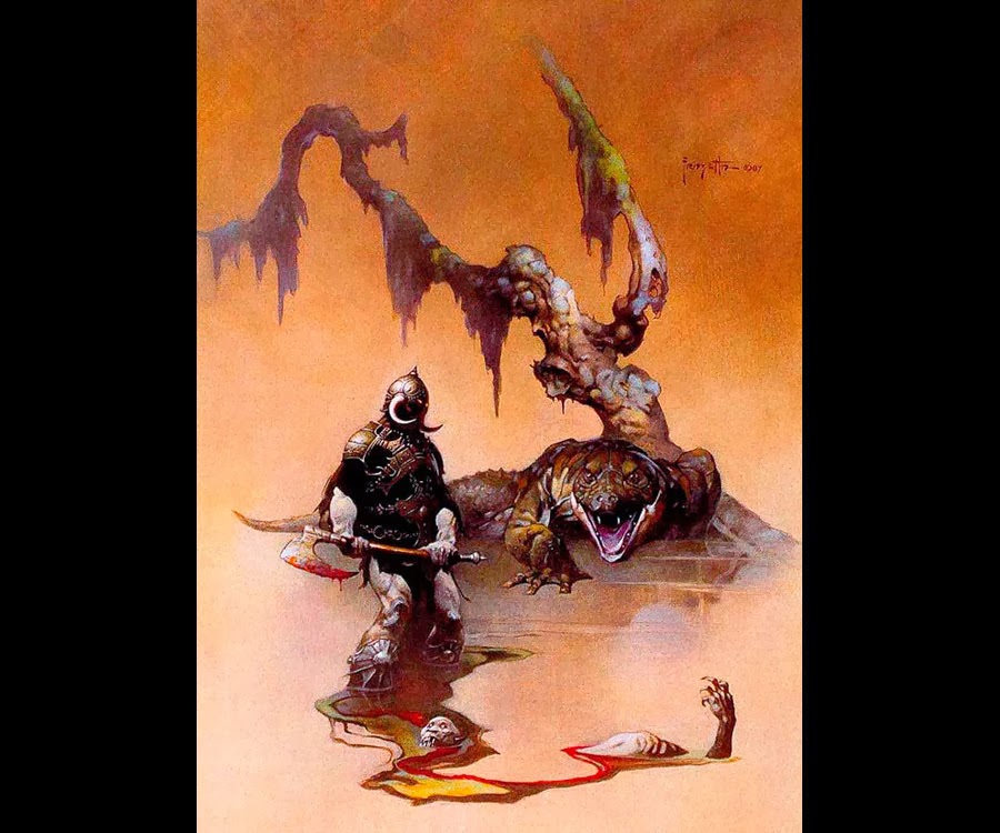
Before I dive into concepting character ideas, I feel it is particularly important with this project to build up a suitable catalogue of appropriate research. This is due to the brief clearly stating the two main influences for the piece: Frank Frazetta's 'Death Dealer' and the 2008 'Prince of Persia' game.

I will also add a few of my own artistic influences, as I feel it will help add a touch more variety to my research, given the limitations of just the two areas of reference asked for in the brief.

To begin, I will first of all have a more in depth look at the works of Frank Frazetta. Mainly his 'Death Dealer' series, but also his other works will act as good sources of inspiration.

Here is a link to a website that has catalogued his works:
http://frankfrazetta.net/index.html


Frank Frazetta's 'Death Dealer' series in order:


Other Frank Frazetta pieces that I find inspiring:

Against the Gods

Barbarian

Eternal Champion

Moonmaid

Seven Romans

Silver Warrior

Sun Goddess


Two things in particular stand out for me in Frazetta's work:

1 - A masterful knowledge and application of anatomy.

2 - A dramatic sense of scale and epicness.

I hope to emulate both of these things in my character design and final pieces.


Now that I have a variety of Frazetta's work, I shall now document the work on the 2008 rendition of the classic game 'Prince of Persia.'


The artwork in the 'Prince of Persia' game is very stylised, combining realistic proportions with a look almost reminicent of the rotoscoping used in the film 'A Scanner Darkly,' as shown below:


I believe that Frazetta's style, combined with that of Prince of Persia 2008 will make for an interesting result that I believe will work to produce suitably epic characters.

However, even with both these areas of reference, I believe it's important to also look at other similar concepts for research for a slightly broader view on the spectrum.


The 'Prince of Persia' artwork also reminds me of that which is in the game 'Shank':


Though 'Shank' is much more stylised, I feel it is good reference for the potential direction in which the reimagining of 'The Death Dealer' could go.


There is then one of my favourite artists, Adrian Smith, whose work I believe to be somewhat similar to Frazetta's. The main difference, and an important one I think, is that while Frazetta's works are exclusively traditional, many of Smith's works are digital, though he still produces a multitude of traditional pieces to the same outstanding quality. This, to me, shows that traditional or digital, the same quality of work can be produced, along with portraying your own style through both mediums. Hence why I seek that one of my final pieces shall be traditional, the other digital so as to show I can apply the theories I have learned to both.

Here is a link to Adrian Smith's website:

http://www.adriansmith.co.uk/

Furthermore, here are a number of his works that I find particularly compelling:


The last piece and the third piece from the top are, in particular, relevant to this project, as they feature warriors reminicent of 'The Death Dealer' and they easily portray Frazetta's ability to create 'epic' paintings.

From here, I shall move onto producing character concepts, as I feel I have a decent catalogue of research from which I can work from. I will of course add more reference images if I stumble across/think of something that could be of use in this project.


I was in the mood to listen to the band Manowar and I realised that their album art is clearly inspired in some way by that of Frank Frazetta's. I think that they too can be of use as inspiration to me.


I also recently purchased both the 'Darksiders' games and noticed that the second one in particular is very much like a cross between Frazetta's work and the style of the 2008 'Prince of Persia'. Again, I think this could be suitable research for redesigning the 'Death Dealer' character. Rather aptly, you actually play as Death in 'Darksiders 2'.


I have decided that I will redesign 'The Death Dealer' character as if he were to be a boss in a game, taking great influence from the bosses of the 2008 'Prince of Persia' game. The game features 5 bosses:

The Alchemist - Artwork

The Alchemist - in game

The Concubine - Artwork

The Concubine - in game

The Hunter - Artwork

The Hunter - in game

The Mourning King - Artwork

The Mourning King - in game

The Warrior - Artwork

The Warrior - in game

I feel that making 'The Death Dealer' a boss character will allow me to make him look suitably 'epic', following in the footsteps of Frazetta's works, as bosses tend to be powerful and fully exemplify the role they play.

For instance, 'The Death Dealer' is clearly a warrior character and I should play on the this to the extremes.

Given also that 2 character images are required, I think it would be a good idea to design regular 'The Death Dealer' boss and a powered up version, as it is often common place for bosses to become more powerful the more damage they recieve.


The defining features of 'The Death Dealer', to me, are as follows:

- Male
- Muscle-bound
- Warrior
- Large Axe
- Shrouded Face
- Horned Helmet

Now with the research stage complete to a stage where I can begin actually concepting the character, I shall begin the process with silhouettes in a new post.